Wednesday, December 5, 2012
TeraBrite-In Honor of Her Heart
Mixed Media-Folk Art-Isabella Kung
Carl Warner-Food Photographer
Carl Warner, photographer, born in Liverpool, England 1963. His work consists of "foodscapes" as he likes to call them. And if you look at his images you can see why. His work is of landscapes made up of food! That is something you can just eat up. The pieces are built up on top of a large purpose triangular table top. The scenes are of photographed into layers from foreground then to background. They sky is a process & as he says, very time consuming. The food surfers from, because it wilts under the lights. But, each elements i then put together in post production so they can finally get the beautiful image that so much is put into it. "Although I’m very hands on with my work, I do use model makers and food stylists to help me create the sets. I tend to start with a drawing which I sketch out in order to get the composition worked out, this acts as a blue print for the team to work to.” I like Carl's work, looking at photography in a new perspective as of landscapes as well. When you look at his pictures, you get the feel of the landscapes, the peaceful, siren feeling as if you were looking at original image as well. Though you probably wouldn't get as hungry looking at the original.
OK Go-Invincible
Variety Of Rainbows
I wanted to talk about variety of rainbows, colors. I'm still trying to get a better understanding of color theory & how to create that in my work. It isn't easy for me, but I'm on my way. On top, I chose those two because one's a photograph but the one on the right is a painting. And they are very similar, but the painting isn't of the photograph. They're similar based on what they are, but colors are totally different. The photograph is darker, & the colors are more siren. But the painting is brighter & the colors are more juicy. Then the one in between the two is a painting of a boat & the colors are of orange, violet, blue, pink, & green. Totally different than the two above it, but you see so much variety of color & value than the painting to the right above it. Then you see the painting to the bottom left of the boat painting using complementary colors which is what a normal rainbow is. In the painting you see a silhouette of a girl under an umbrella grow stronger of the image from left to right. The background consists of the complementary colors as of water flowing down & the emphasis is of the silhouette. I like to look at different images, paintings, of colors & grasp more of what color theory is & how to create it.

Sunday, October 28, 2012
Panic! At The Disco-Ready To Go
Panic! At The Disco, Ready To Go from their third album Vices & Virtues released June 6, 2011 is a 3:22 music video. Through out the video you notice how in the background is dark but you see that the emphasis is on Brenden Urie (the singer/guitarist) & Spencer Smith (drummer) yet the dark shadows on them. And as the video goes on & the band is playing the value on them gets brighter. But then when the band is playing on the roof top their dark but the background around them is brighter so the emphasis is still on them but the light changes. I like how the director still kept it on them but put it in the background. Later on when Brenden Urie is being shot out of the cannon he is being shot in this animated sky which is using complementary colors of orange & blue with yellow as well. I like how the animation of color fits in the video with so much dark in it. And when he lands on the ground & is dancing with people with umbrellas him & some of the other dancers, which are girls are wearing dark colors & have bright umbrellas. But some of the other dancers have both bright color outfits & umbrellas. I think its to keep the emphasis on the girls girls & Brenden as well. I like that settle hint of emphasis as well. I chose this video because its an entertaining video to watch & I didn't really notice all the emphasis & color till I started to think about it. Noticed it one day then decided to talk about it in blogger.
Tim Burton-Frankenweenie

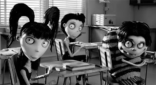
Frankenweenie is a Tim Burton stop motion movie. Its a story about a young boy named Victor who's dog gets hit by a car & dies. He is very sad then in Science class he learns that he resurrect his dog with electricity. This movie is very unique because of the fact that its a black & white 3D stop motion movie, & of course that its a Tim Burton movie as well. The form of each character is unique because they all each have special characteristics. Young Victor looks the most normal but his eyes are emphasized with a slight dark shadow are them. Nassor looks like Frankenstein with his squared head & long face. Weird girl with her oddly cut hair & huge eyes. I have yet to see the movie but from what I can tell you is that each character has there own special thing about them with just by the form of how they're shaped. I chose this because I'm a huge Tim Burton fan, & I love stop motion. And since its almost Halloween, I might as well talked about this great movie.
Friday, October 26, 2012
The Used-All That I've Got
The Used, All That I've got, 3:54 video, released December 7, 2004, off their second CD "In Love & Death." I choose this video because I enjoy watching it every time I watch it no matter how many times I've seen the video or have listened to the song. I love everything about this video, the story, the value, how bright it is, but my favorite part would be the end of it. When the little boy finds "HE" & it turns out that the little boy is "HE." And "HE" turns into the story in the book. I love the art in the cartoon. But before that I love that in the video the black & white lines that come into to video as it starts turning into the story in the book. Bringing the video into the story from the sides of the video to take over the whole thing. I really like that concept. Unifying everything from the book, the band, "HE" into the story of the book.
Monday, October 1, 2012
Andreea Gheorghita- Photographer
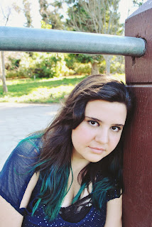
 Andreea Gheorghita is a 19 year old girl. Lives in Loma Linda California. Most of her pictures are of people. She likes to use a lot of different elements when it comes to taking pictures. She uses contrast in her black in white photos to show emphasis to show the depth in the picture. The other way she uses contrast is so when its connected with color, the clarity helps that your eyes carries around. To make the subject or focal point more obvious. Dre also likes to show those extra details with the lighting to really show depth. She uses hue to show the smaller details of color on the focal point while everything else in the background or around the focal point blurs.
 Thursday, September 27, 2012
Lisa Frank

Wednesday, August 22, 2012
Kat-Taylor Swift Emotionally Picky
Kat's video relates to painting other than the fact she painted Taylor Swift with a guitar pic is line. Line because you see with stop motion how Kat is going from thing to another & get a fill of how she's doing it. And value you see as the video is going where Kat fills it in like Taylor Swift'a hair, face, ect. And then you have contrast you have a black painting on a white piece of paper. I choose this because I love Kat's videos. Her art & how she does her work adds some more flavor to the art world & it's refreshing to see than compared to some other artists out there.
A painting of Taylor Swift I made using a guitar pick dipped
into black paint... instead of using a standard paint brush method.
Art Piece Dimensions: 2ft. 8in. x 3ft. 9 in. butcher paper.
Creative Time: 4 hours to make
Art Piece Dimensions: 2ft. 8in. x 3ft. 9 in. butcher paper.
Creative Time: 4 hours to make
All artwork will usually be sprayed with a coat of a matte
finish permanent fixative before shipment to reduce it's aging process.
Monday, August 20, 2012
Blu-Big Bang...Big Boom
Blu's Big Bang, Big Boom shows all kinds of emphasis, proportion, line, form, shape, & space. And space is an understatement because obviously he uses a lot of space. And if it isn't obvious already of how this video is made is stop motion. Uses emphasis because throughout the whole video your focused on the motion of the drawings. Line because you see the motions as the pictures move. And of course shape & space because the shapes are changing as well as space when they move from place to place. I choose this because Jessica wanted me to talk about it in class & Blu's video are just awesome.
Subscribe to:
Comments (Atom)


